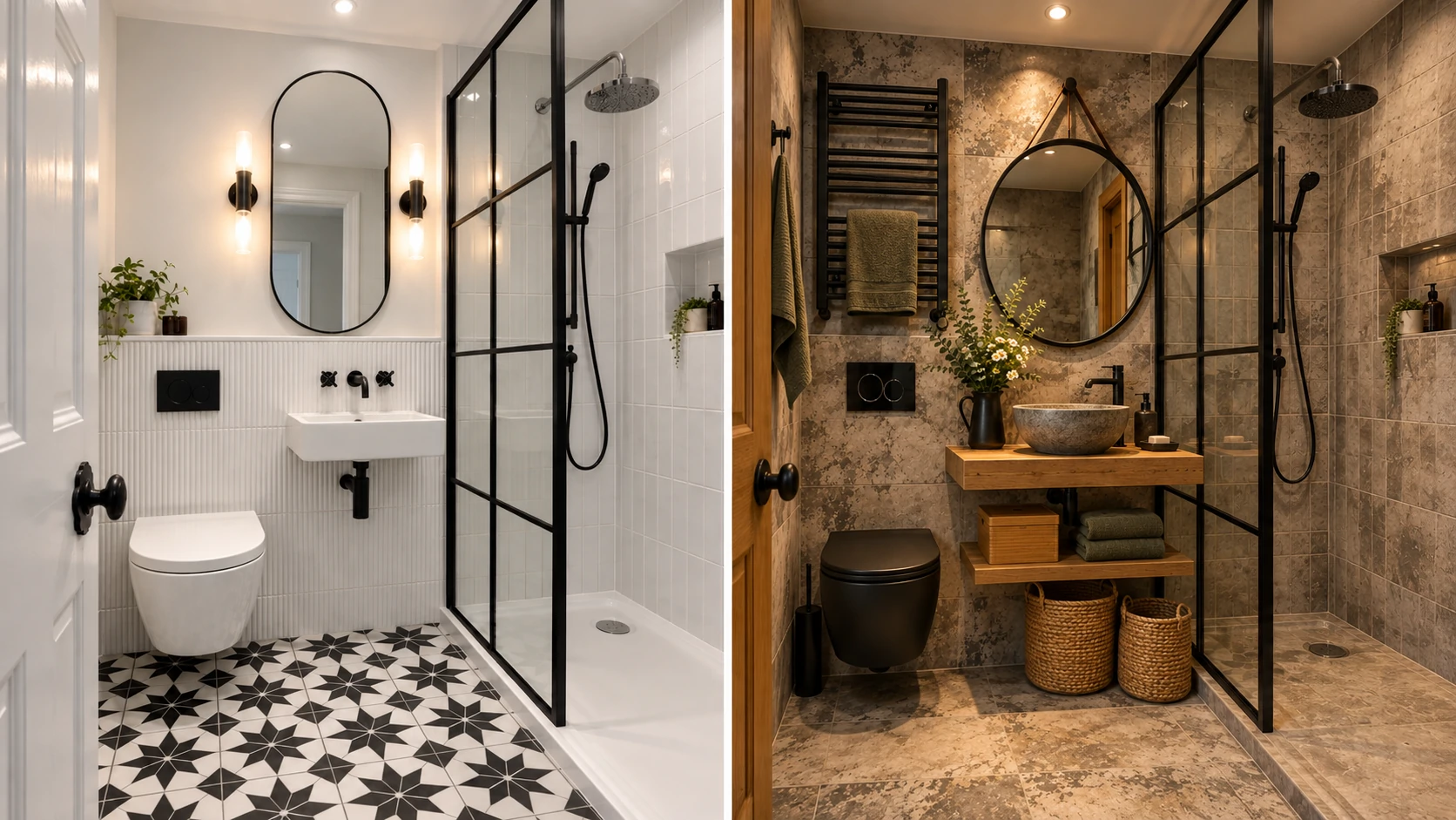
If you’ve spent any time scrolling renovation inspiration, you’ve probably noticed the same three words repeated endlessly: “go light, go large, go diagonal.” It’s not wrong advice, exactly — it’s just incomplete. The truth is that tile pattern is one of the few design decisions in a small bathroom that does real, measurable optical work, and most of the advice out there skips the part that actually matters: why it works, and where it falls apart.
Quick answer: Large-format tile (12”x24” or bigger) laid with minimal grout lines, a diagonal layout on the floor, or a single-tone herringbone pattern are the three approaches that genuinely make a small bathroom read as larger. The common thread isn’t the pattern itself — it’s the number of visual interruptions your eye has to process. Fewer grout lines and fewer color breaks mean your brain reads the surface as one continuous space instead of a patchwork of small ones.
That’s the one-sentence version. Here’s everything underneath it — including the trade-offs nobody mentions until you’re halfway through a renovation.
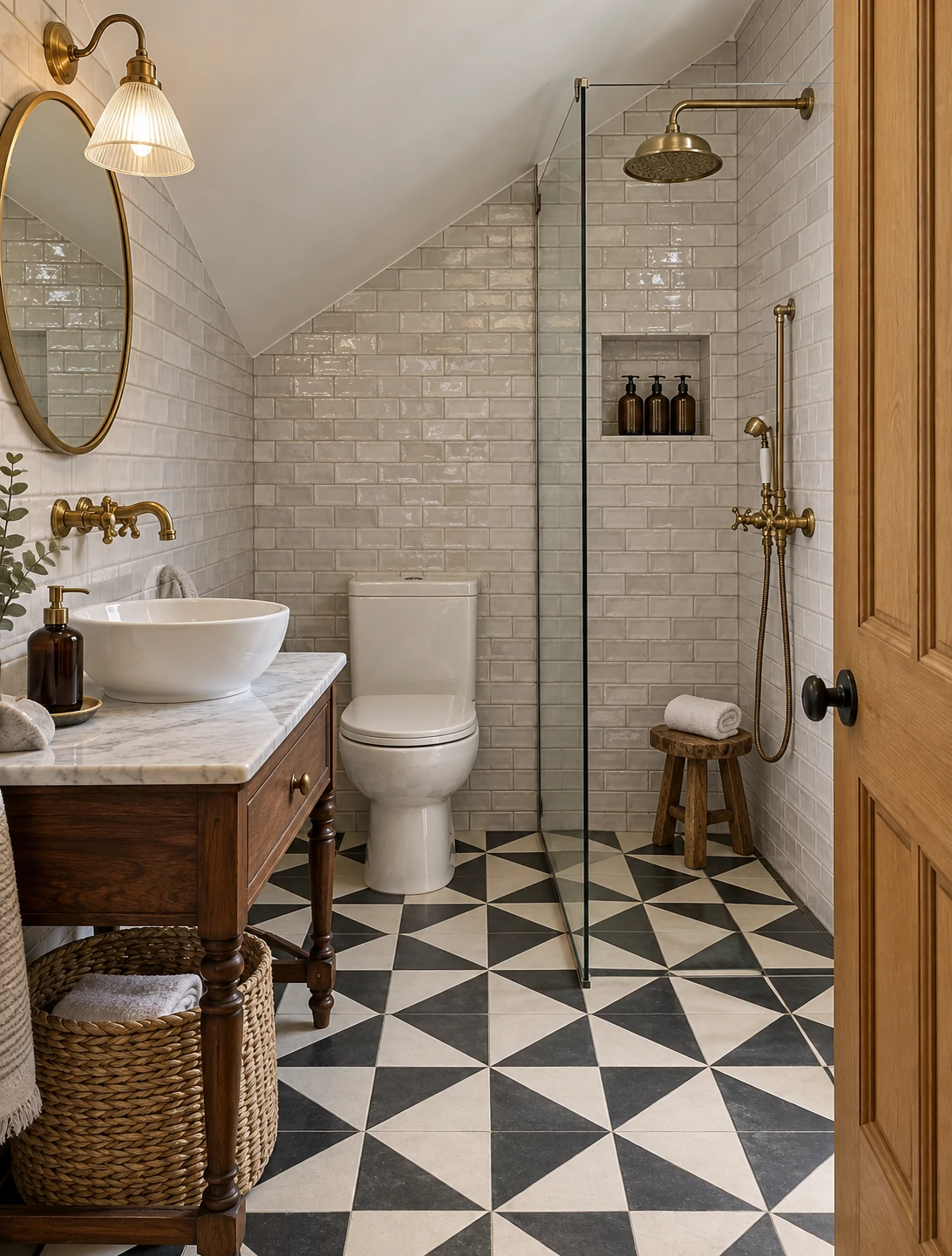
Why Tile Pattern Actually Affects How Big a Room Feels
This isn’t decorating folklore — it’s about how your eye processes visual boundaries. Every grout line is a tiny stop sign. Your brain uses those lines to measure the room, almost unconsciously, the same way you’d count floor tiles to estimate a room’s size without a tape measure. The more stop signs there are, the more “measuring” your eye does, and the smaller the space registers.
Large-format tile removes most of those stop signs. Diagonal layouts don’t reduce grout lines, but they do something different — they stretch the visible line of the room from corner to corner instead of wall to wall, which is a longer line than the room’s actual width. Herringbone works through a third mechanism: movement. It creates a rhythm that pulls the eye along the floor rather than letting it land and stop, which reads as flow rather than boundary.
None of these patterns changes a single wall measurement. They all work by managing what your eye does, not what’s physically there — which is exactly why pattern choice outperforms color choice in small bathrooms, even though color gets most of the attention in design content.
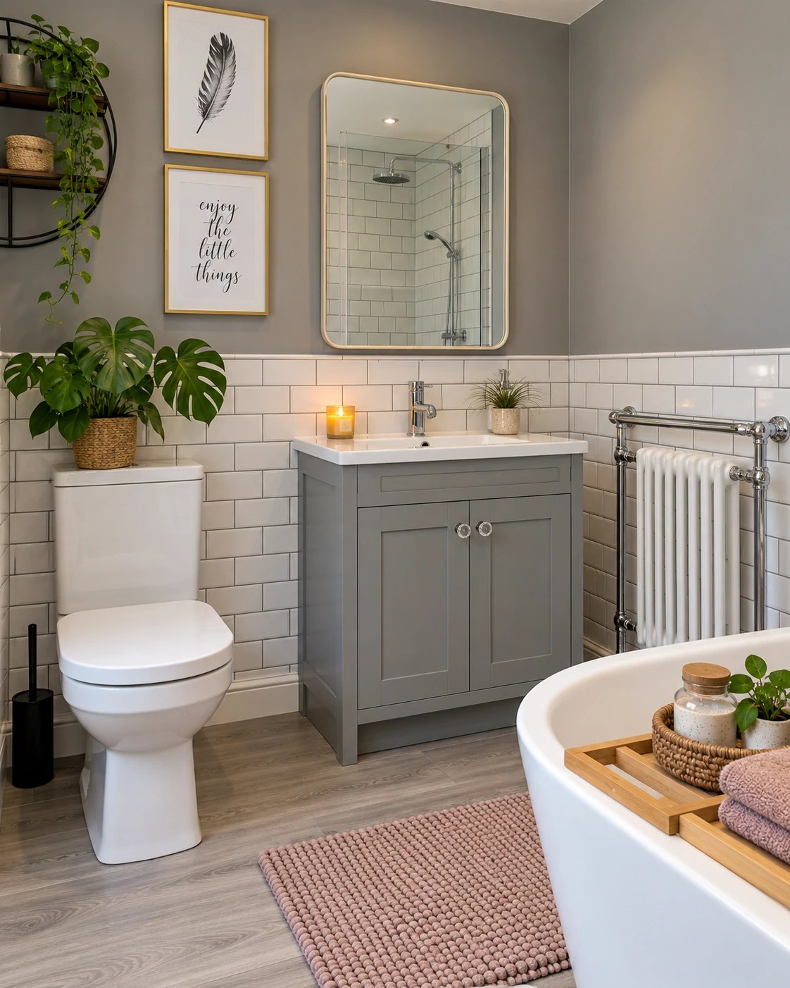
The Best Patterns for Small Bathrooms, Compared
Not every pattern that looks good in a 12x12 bathroom translates to a 5x7 one. Here’s how the main options stack up specifically for small spaces.
| Pattern | Defining Features | Cost Tier | Maintenance | Best Room Size | Resale Appeal | Trend Longevity |
|---|---|---|---|---|---|---|
| Large-format straight lay | Minimal grout lines, clean uninterrupted surface | $$ | Low — fewer grout lines to clean | Any small bathroom, especially under 40 sq ft | High — broadly neutral | Very high, consistently safe |
| Diagonal (45°) | Square tile rotated, lengthens sightline corner to corner | $$–$$$ | Low–Medium | 5×7 ft to 8×10 ft | Medium–High | High, long-standing technique |
| Herringbone | Zigzag interlocking rectangles, adds movement | $$$ | Medium — more grout lines | Medium-small, not micro bathrooms | Medium | Medium — trend-sensitive if bold color used |
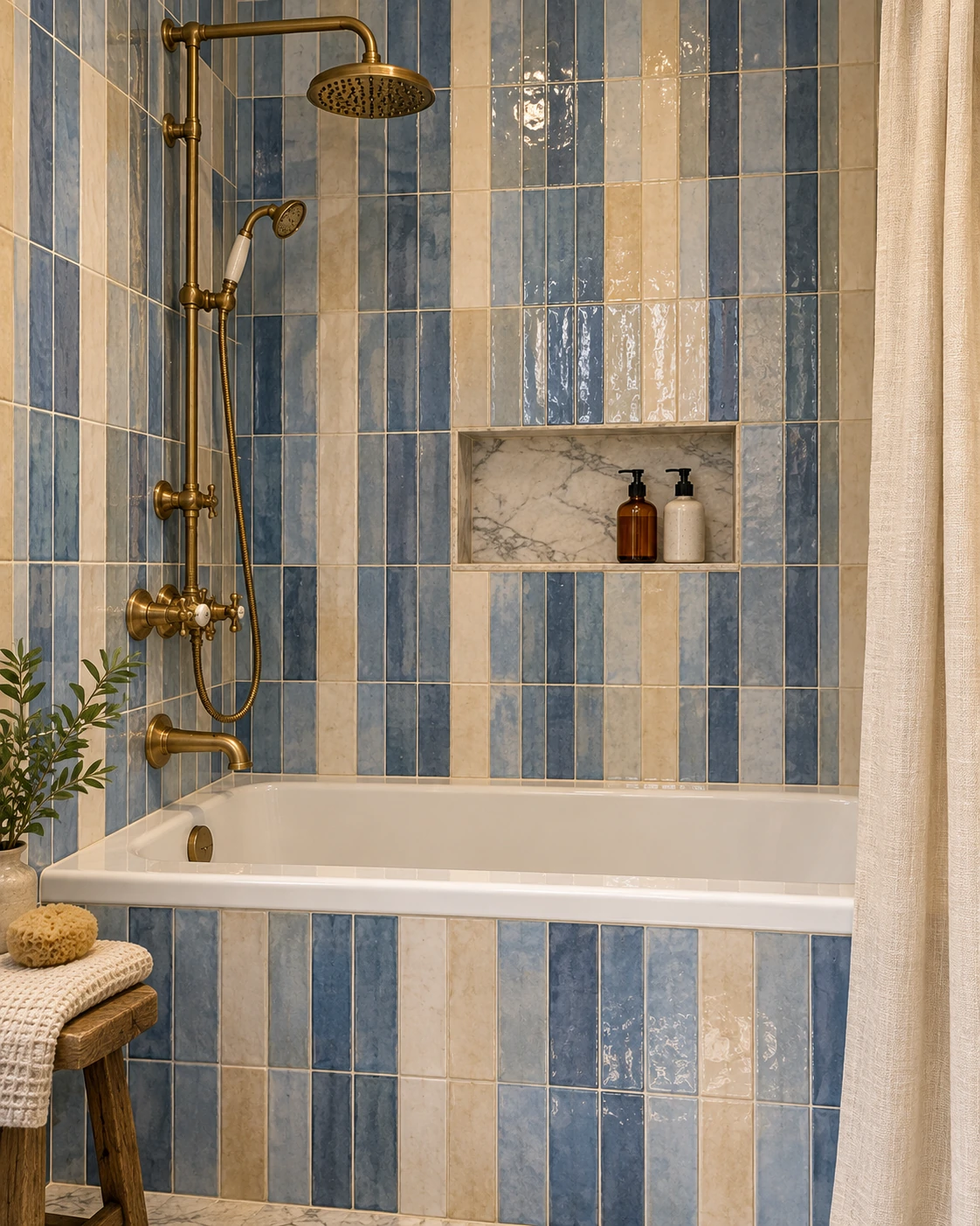
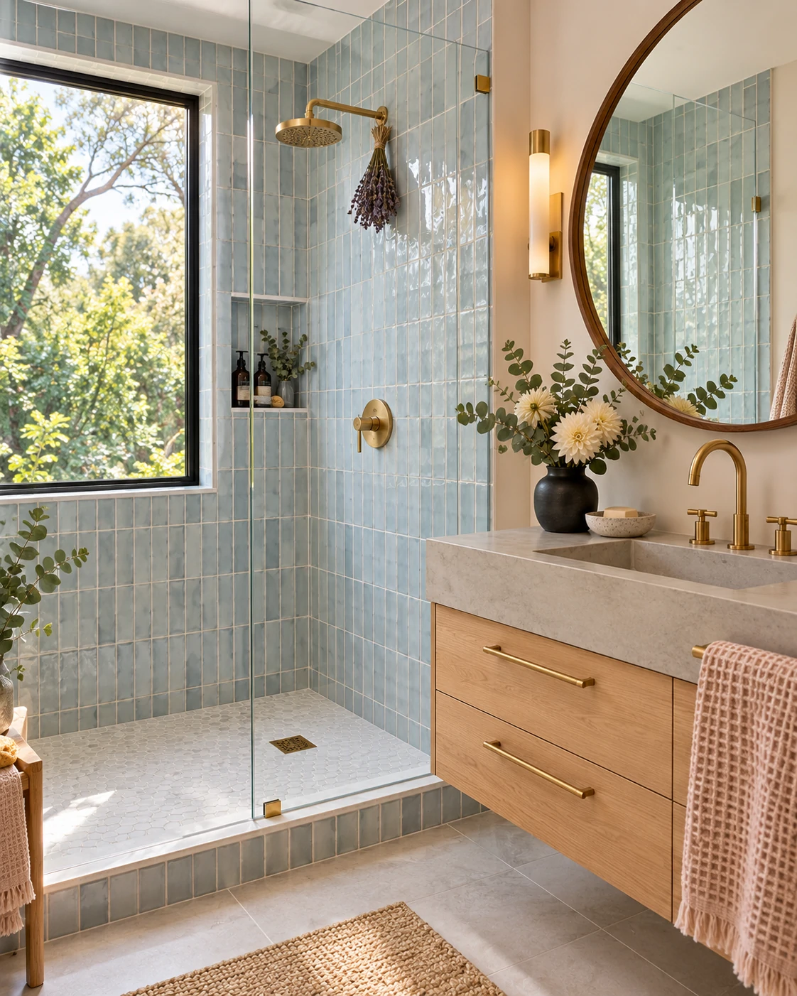
| Vertical stack | Tile stacked vertically on walls, raises sightline | $$ | Low | Any, especially low-ceiling rooms | Medium–High | High |
| Basketweave | Small tile woven pattern, textured look | $$$ | Medium–High | Accent use only in small spaces | Medium | Medium — classic but can read busy |
If you only take one thing from that table: large-format straight lay is the safest, lowest-risk, lowest-cost option, and it’s the one most professionals quietly recommend when a homeowner asks “what won’t I regret?”
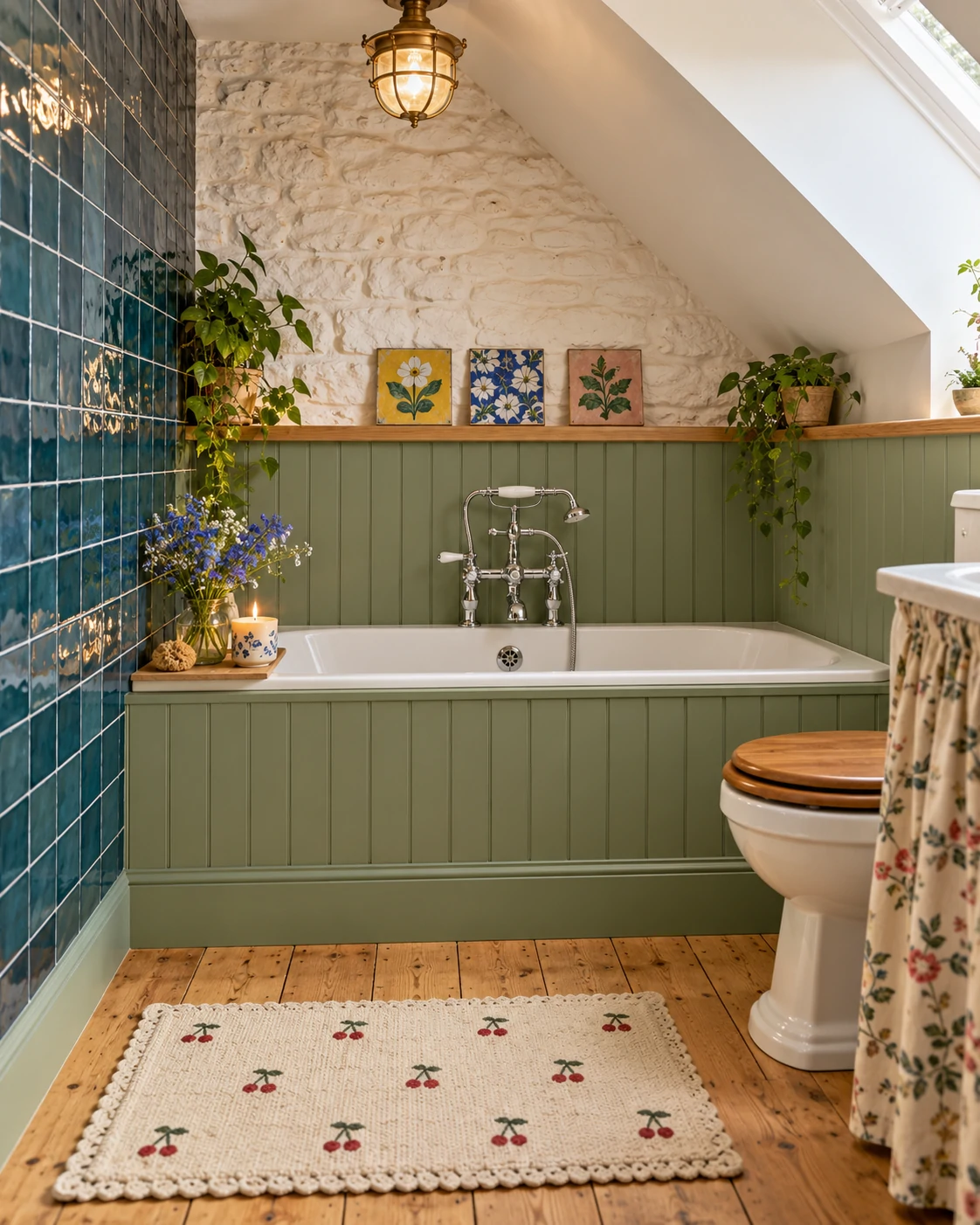
Large-Format Tile: The Safest Bet, and Why It Works So Well
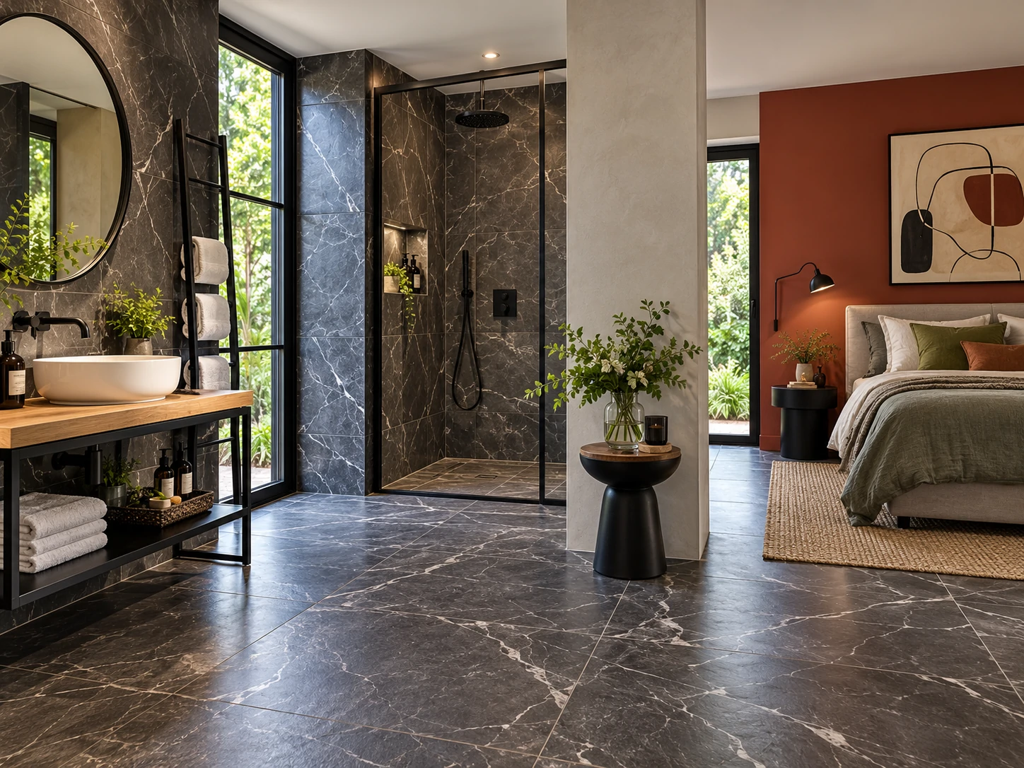
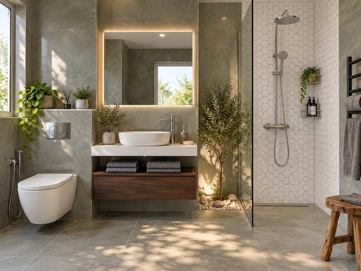
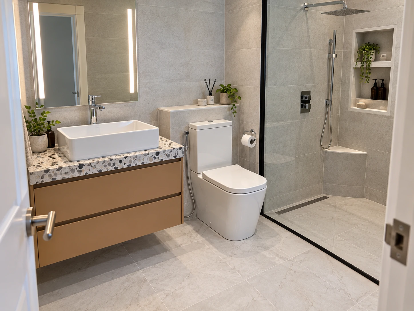
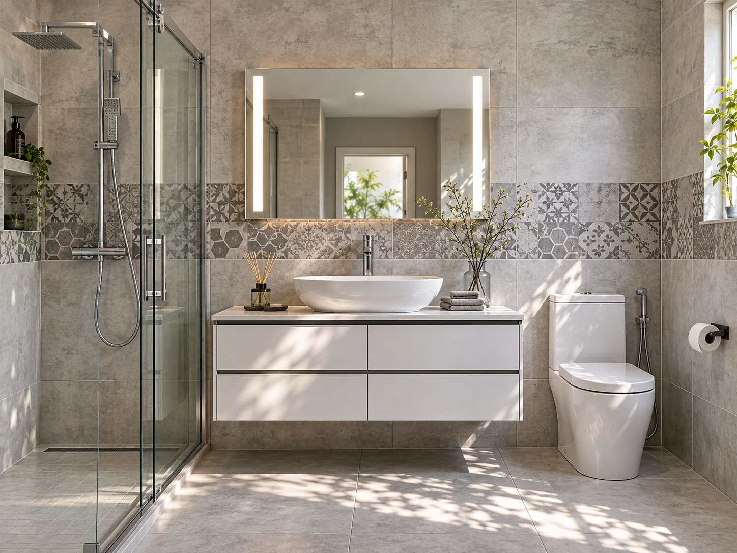
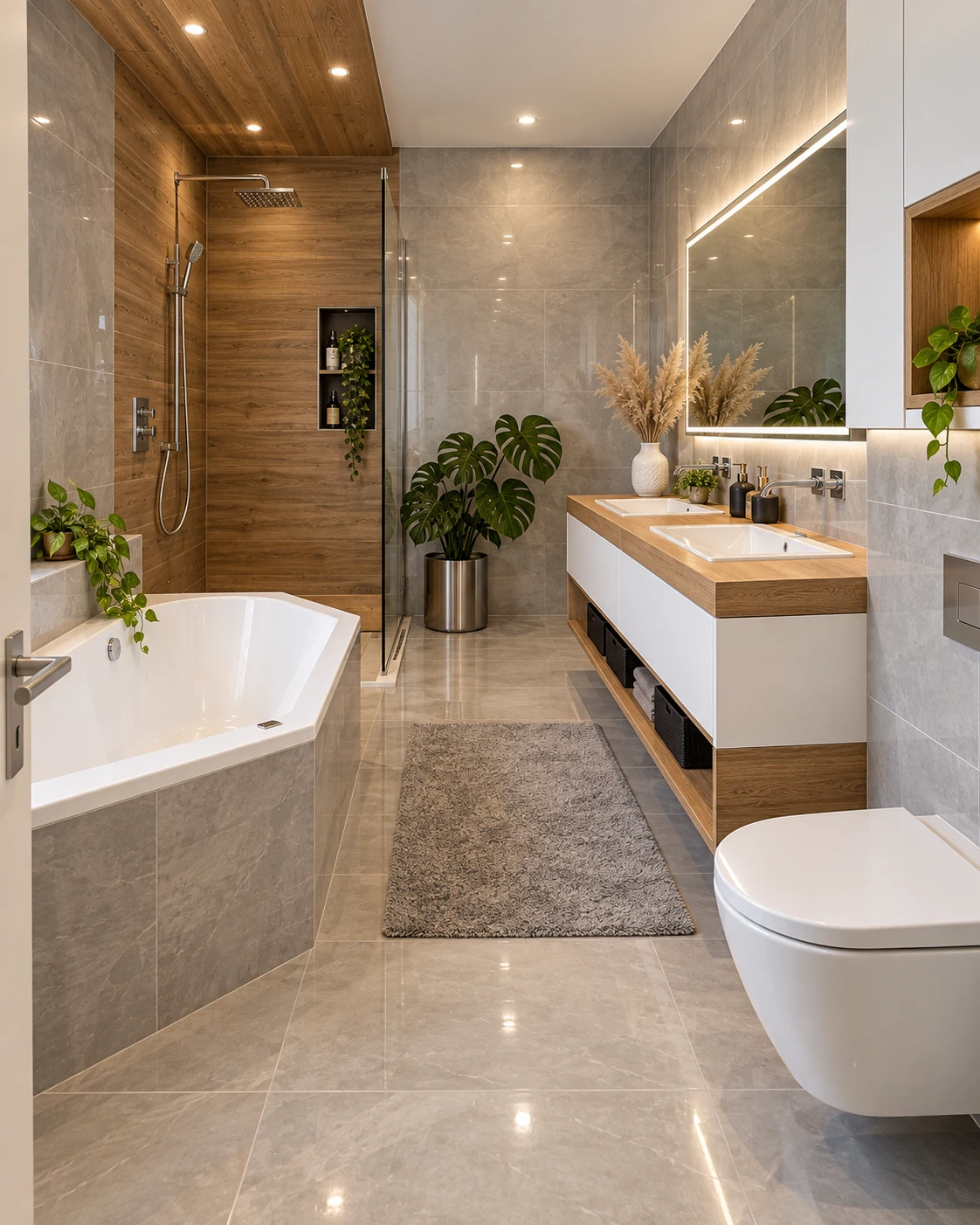
“Large-format” generally means anything 12”x24” or bigger, though many homeowners now go up to 24”x24” or even 24”x48” slabs in small bathrooms. The appeal isn’t really the size of the tile — it’s what the size does to the grout. A 12”x24” tile on a 5x7 floor needs roughly a third of the grout lines that a 12”x12” tile would, and less than a tenth of what a small mosaic tile requires.
The trade-off most people don’t expect: larger tile needs a flatter substrate to sit properly, and it’s less forgiving of minor subfloor imperfections than smaller tile, which can flex into small dips. In an older home, that sometimes means a self-leveling compound gets added to the quote that wasn’t in the original budget. It’s a small cost relative to the visual payoff, but it’s worth asking your tiler about upfront rather than finding out mid-project.
Diagonal Layout: What It Really Costs You
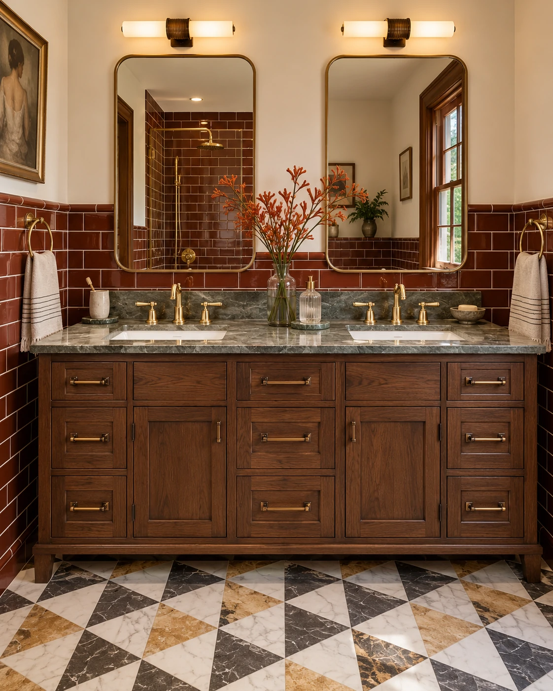
Diagonal tile is one of the oldest tricks for making a boxy room feel longer, and it still works because it’s based on geometry, not trend. Rotating a square tile 45 degrees means the longest visible line across the floor runs corner to corner — which, in a small rectangular bathroom, is mathematically longer than either wall.
What rarely gets mentioned: diagonal layouts waste more tile. Every edge tile along the perimeter needs an angled cut, and those offcuts usually can’t be reused elsewhere in the room. Expect 10–15% more material than a straight lay from the same floor area, plus a modest labor upcharge for the extra cutting time. It’s not a dealbreaker — it’s just a cost that should be in the budget conversation from day one, not discovered when the tiler asks for more material halfway through.
Herringbone and Chevron: When They Work (and When They Don’t)
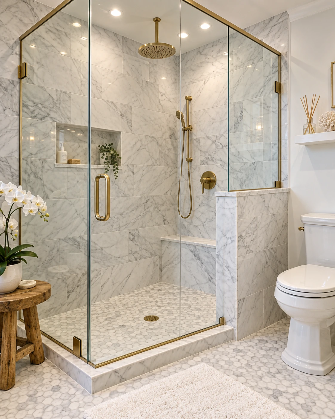
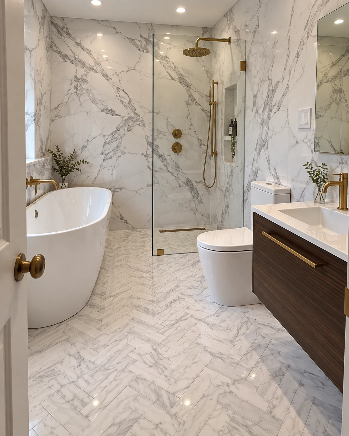
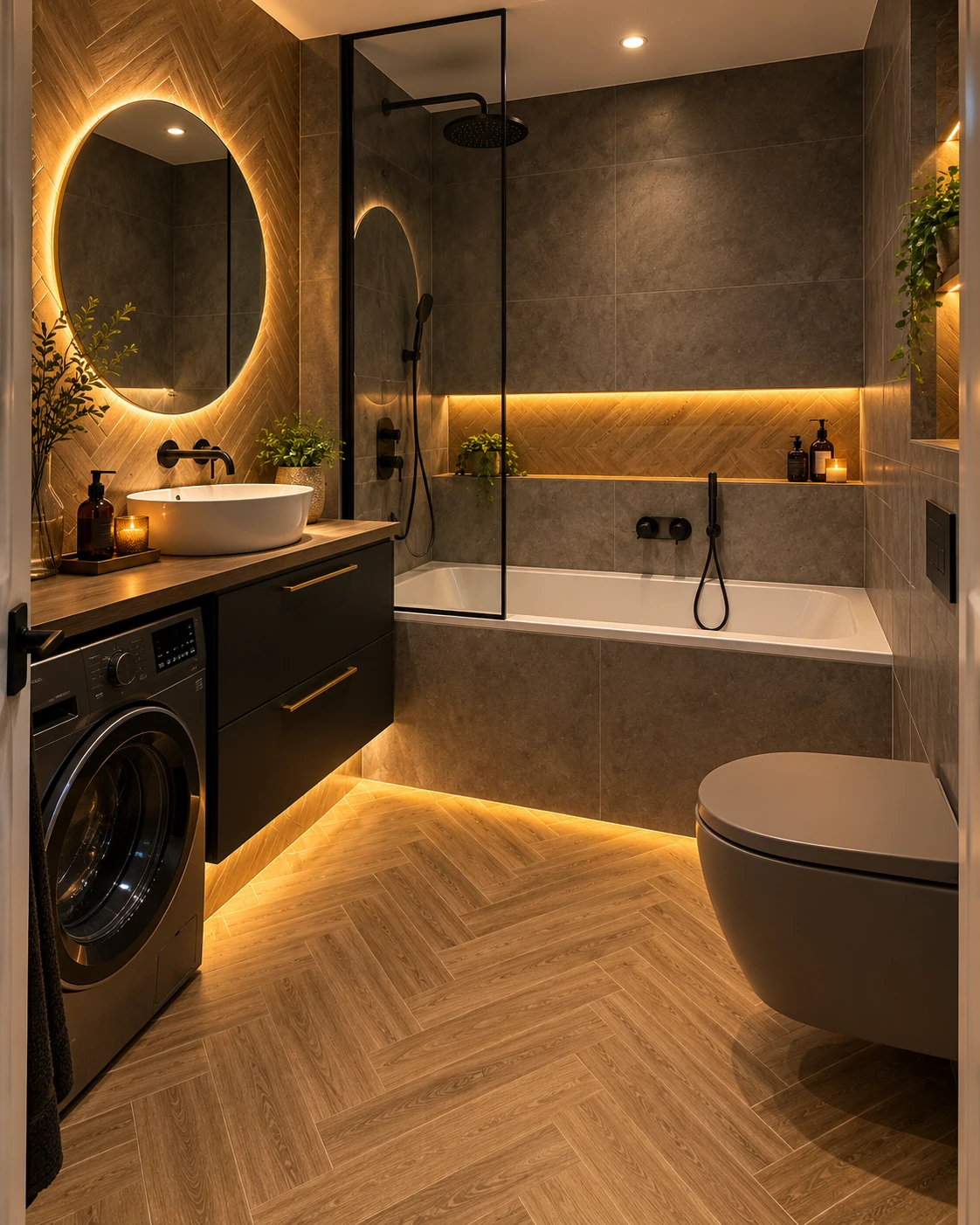
Herringbone has a very specific job: it adds movement and texture without adding visual weight, but only when it’s kept in a single, muted tone. The moment you introduce a bold color or a strong grout contrast into a herringbone layout, the pattern stops reading as “flowing” and starts reading as “busy” — and busy is the opposite of what a small bathroom needs.
There’s also a structural requirement competitors rarely bring up: herringbone and chevron are unforgiving of an uneven subfloor. Each tile sits at an angle against its neighbor, so any dip or hump in the floor shows up as lippage — a slightly raised or uneven edge — right at the points of the pattern, which is exactly where your eye naturally looks. In homes over 20–30 years old, it’s common for a tiler to recommend floor leveling before a herringbone install, which adds cost but prevents a pattern that looks slightly “off” the moment the grout goes in.
⚠️ Herringbone and chevron patterns are unforgiving of an uneven subfloor. Budget for floor leveling in older homes before committing to these layouts — skipping it is one of the most common sources of post-install regret tilers report.
Used well — single tone, floor only, walls kept plain — herringbone is one of the more distinctive choices that still works in a small space. Used carelessly, it’s the pattern most likely to backfire.
Grout Color: The Variable Everyone Skips
Here’s the one most design articles leave out entirely, and it might matter more than the pattern itself: grout color can cancel out everything you just paid for.
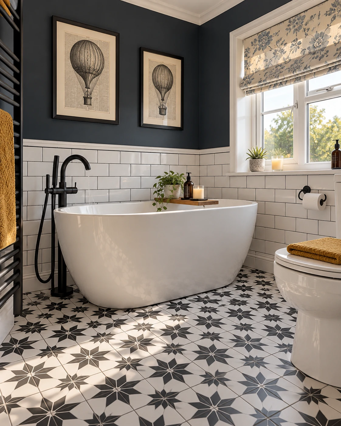
A large-format tile chosen specifically to reduce visual breaks will still look choppy and small if it’s grouted in a sharply contrasting color. High-contrast grout essentially outlines every tile, turning a “seamless” tile choice back into a grid. The fix is simple — keep grout within one or two shades of the tile itself — but it’s rarely stated outright, probably because it doesn’t photograph as dramatically as a before-and-after tile swap.
⚠️ Grout color is a structural part of the “bigger” effect, not a finishing touch. Match it within one to two shades of the tile, especially with large-format or diagonal layouts.
The trade-off: lighter grout shows staining and discoloration faster than darker grout, particularly around high-moisture areas like the shower floor. It’s a maintenance cost worth knowing about before you commit, not a reason to avoid light grout altogether.
Tile Pattern Mistakes to Avoid in a Small Bathroom
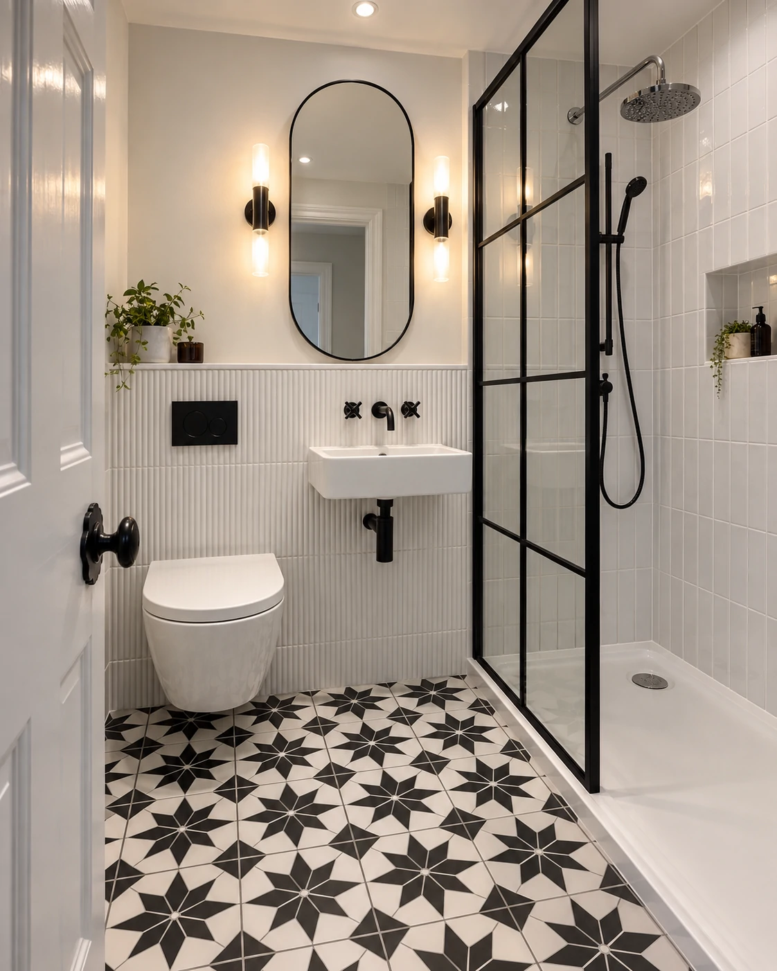
- Using a bold or oversized pattern in a true micro-bathroom (under 30 sq ft) — the pattern dominates the room instead of expanding it.
- Choosing high-contrast grout for a “crisp” look — it emphasizes every tile edge and visually shrinks the floor.
- Mixing pattern direction between floor and walls without a plan — competing sightlines cancel out the elongating effect.
- Picking small mosaic tile for the entire floor — more grout lines overall, even when individual tiles are inexpensive.
- Skipping subfloor leveling before a herringbone or chevron install — uneven lippage breaks the clean lines the pattern depends on.
- Switching tile types at the shower threshold — creates a visual “stop” that undercuts the continuity effect.
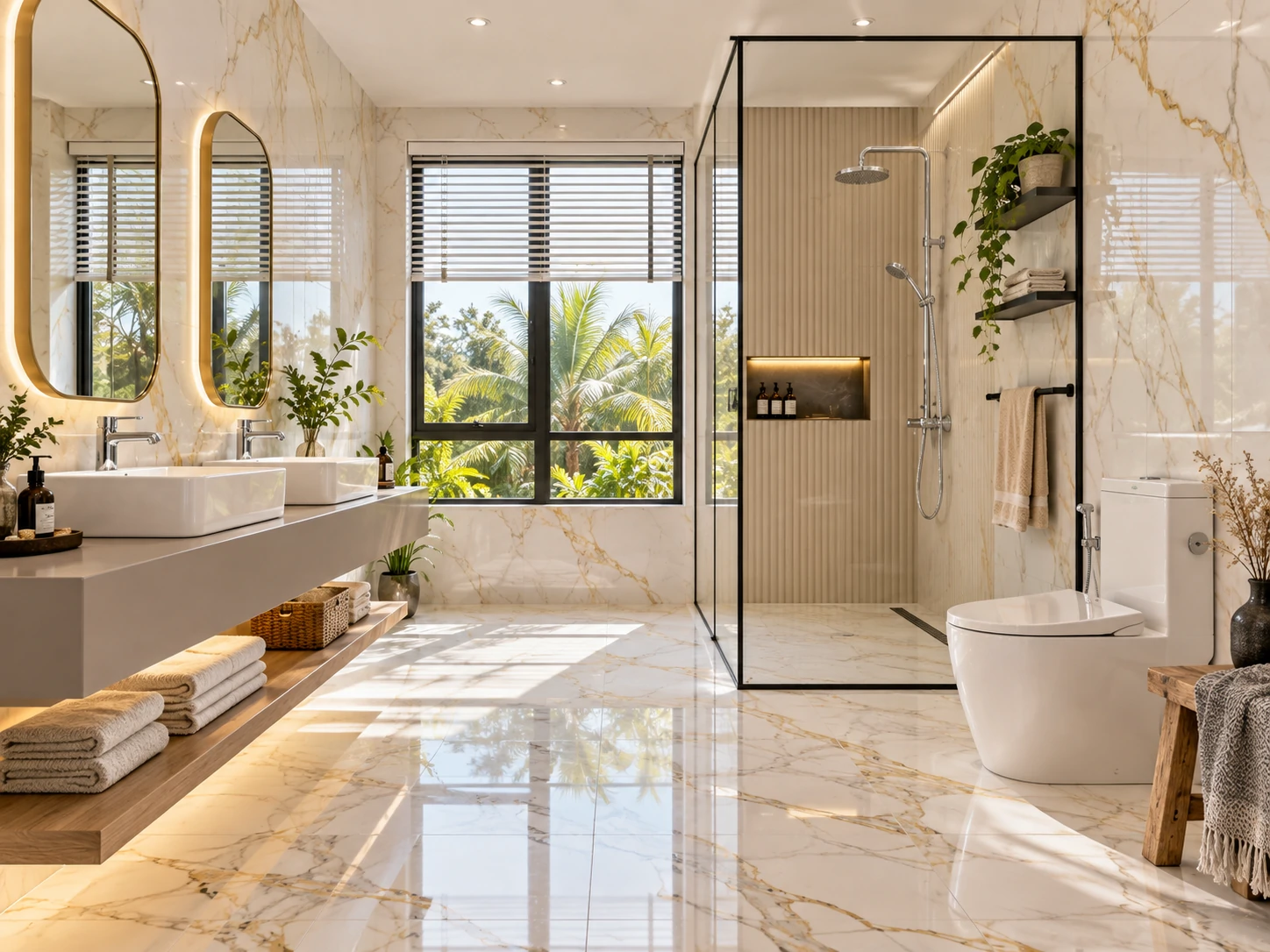
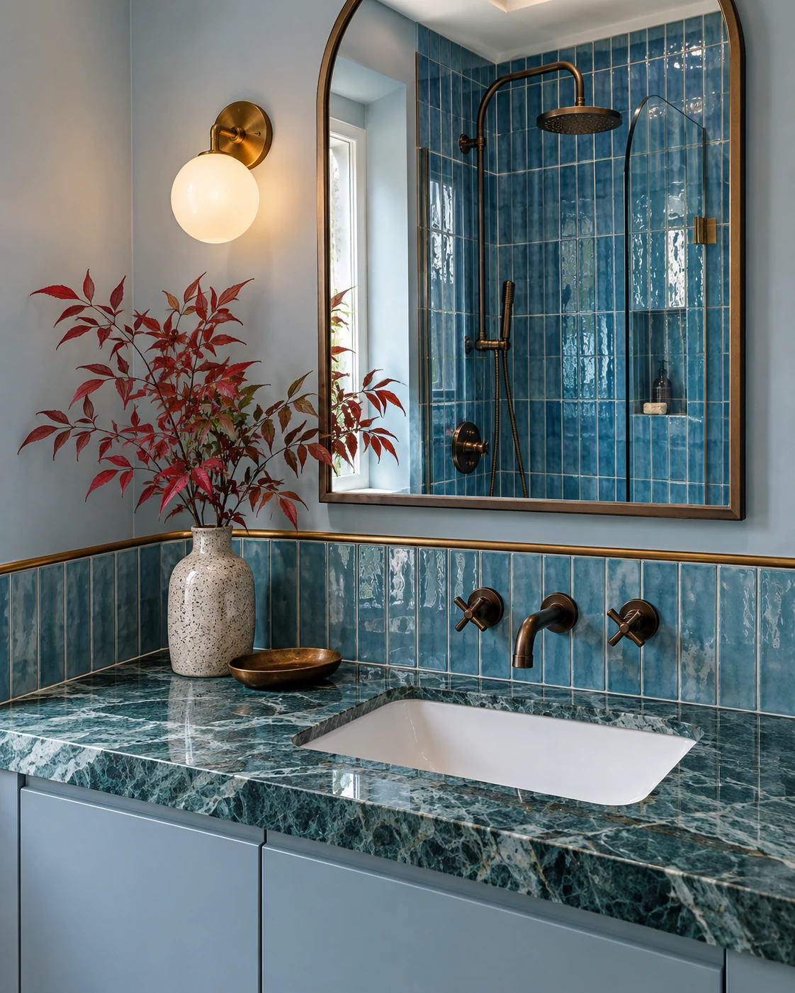
- Choosing high-gloss tile under a single small window — glare and reflections add clutter rather than brightness.
- Underestimating diagonal or herringbone material waste and running short mid-install.
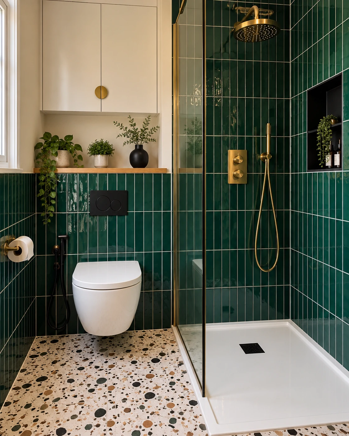
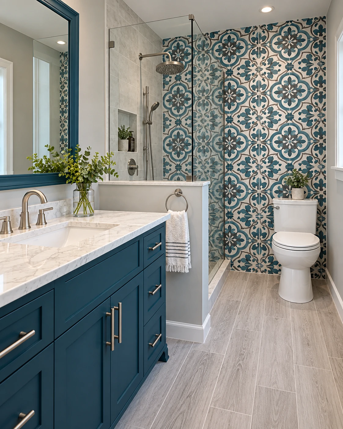
- Pairing a trend-driven dark color (deep green, navy) with a high-movement pattern like herringbone — it doubles down on visual weight in a space that needs the opposite.
- Hiring a general contractor for herringbone or chevron work instead of a tiler experienced specifically in pattern layouts — uneven points are difficult to fix after grouting sets.
DIY vs. Professional: Where the Line Actually Is
A straight lay or vertical wall stack is genuinely DIY-achievable for a patient homeowner with basic tiling experience — the layout math is simple and small errors are forgiving. Diagonal and herringbone are a different story. A few degrees of drift in a diagonal layout becomes visible across a small floor in a way it never would in a large open room, and herringbone has almost no tolerance for layout error once you’re a few rows in.
| Pattern | DIY Feasibility | Why |
|---|---|---|
| Large-format straight lay | High | Simple grid layout, forgiving of minor measurement error |
| Vertical stack | High | Straightforward layout, minimal cutting |
| Diagonal | Low–Medium | Requires precise 45° layout; drift is highly visible in small rooms |
| Herringbone/chevron | Low | Minimal tolerance for error; floor prep sensitivity adds risk |
If you’re DIY-renovating the rest of the bathroom, it’s common practice to hire out just the tile work for these two patterns and handle the vanity, paint, and fixtures yourself.
What It Actually Costs by Pattern
Based on a roughly 35 sq ft small bathroom, here’s where the budget typically lands in 2026.
| Cost Category | Budget Tier ($) | Mid Tier ($$) | Premium Tier ($$$) |
|---|---|---|---|
| Floor tile (material) | $150–$350 | $350–$700 | $700–$1,500 |
| Wall tile (material) | $200–$450 | $450–$900 | $900–$2,000 |
| Grout & setting materials | $40–$80 | $80–$150 | $150–$250 |
| Labor — straight lay | $600–$1,000 | $1,000–$1,600 | $1,600–$2,500 |
| Labor — diagonal/herringbone upcharge | +$150–$300 | +$300–$600 | +$600–$1,200 |
| Waste factor (material overage) | ~7–10% | ~10–12% | ~12–15% |
| Estimated Total | $1,100–$2,000 | $2,200–$3,900 | $4,000–$7,400 |
The gap between a straight lay and a patterned layout is rarely about the tile itself — it’s the combination of labor upcharge and waste factor that adds up.
Maintenance Reality, By Pattern
| Task | Frequency | Difficulty | Notes |
|---|---|---|---|
| Reseal grout lines | Every 12–18 months | Easy | More frequent with herringbone/basketweave due to grout volume |
| Deep-clean grout | Monthly | Easy–Moderate | Light grout shows grime faster than dark grout |
| Check for lippage/wear at pattern edges | Annually | Easy | Diagonal and herringbone edges see more foot traffic wear |
| Inspect shower threshold transition tile | Every 6 months | Easy | Critical where continuous tile meets the shower pan |
| Re-caulk tile-to-tub/shower seams | Annually | Easy–Moderate | More seams in patterned layouts near fixtures |
None of this is a reason to avoid a pattern you love — it’s just the honest version of what “low-maintenance” actually means in practice.
Does This Pattern Work for My Bathroom?
- Bathroom under 30 sq ft → large-format straight lay, light grout; skip bold patterns entirely.
- 30–50 sq ft with good natural light → diagonal layout or vertical wall stacking.
- 30–50 sq ft with little natural light → large-format tile, matte finish; avoid dark or high-gloss patterns.
- Tight budget → large-format straight lay (lowest waste, lowest labor upcharge).
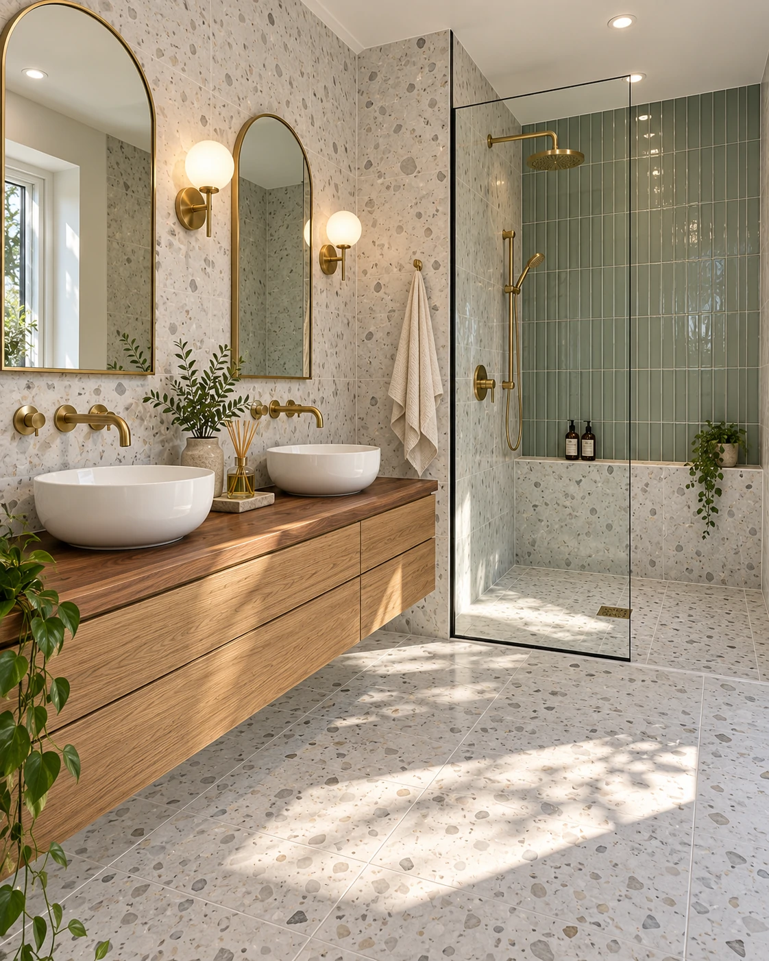
- Want visual interest without losing size perception → herringbone in a single muted tone, floor only.
- Older home with an uneven subfloor → budget for leveling before committing to herringbone/chevron.
- Selling within 3–5 years → prioritize large-format or diagonal in neutral tones.
- DIY renovation → straight lay or vertical stack; leave diagonal and herringbone to a professional.
.webp)
Frequently Asked Questions
Does tile color matter more than tile pattern for making a small bathroom look bigger? Pattern and color work together, but pattern has the bigger structural effect. A light-colored tile in a busy mosaic layout can still look smaller than a mid-tone large-format tile with minimal grout lines. If you can only prioritize one, choose large-format tile with low-contrast grout over chasing the “right” color alone.
Is diagonal tile still considered a current design choice, or is it outdated? Diagonal tile remains widely used because it’s based on optical geometry rather than a passing trend. It pairs well with both modern and transitional bathrooms. It only reads as dated when combined with dated-era tile choices, like small beige ceramic squares from early-2000s builds.
Can I install a diagonal or herringbone pattern myself, or do I need a professional? A straight or vertical layout is DIY-friendly for a confident homeowner. Diagonal and especially herringbone require precise cutting and layout planning — a few degrees of drift becomes visible across a small floor. Most tilers recommend hiring a professional for these two patterns specifically.
Does a patterned tile layout cost more than a plain straight lay? Yes, in two ways: material waste (typically 10–15% more for diagonal or herringbone) and labor, which carries a $150–$1,200 upcharge depending on tile size and room complexity. A straight, large-format lay remains the most budget-efficient option.
What’s the single biggest tile pattern mistake in small bathrooms? Using a small, highly patterned tile — a busy mosaic or bold basketweave — across the entire floor. Even in a flattering color, the sheer number of grout lines creates visual noise that reads as “more surface,” which shrinks the room rather than expanding it.
Should the tile pattern be the same on the floor and the walls? Not necessarily the same pattern, but they should feel continuous. A common approach pairs a straight or diagonal floor with vertical-stack wall tile in a coordinating color. Abrupt pattern or color changes between floor and wall reintroduce the visual “stop” the pattern is meant to remove.
Will a bold tile pattern hurt resale value? It can, depending on how bold and how small the bathroom is. Large-format or diagonal layouts in neutral tones carry low resale risk because they appeal broadly. Herringbone or basketweave in a strong color can be a selling point in some markets and a turn-off in others — neutral tones reduce that risk.
.webp)
.webp)
.webp)
.webp)
.webp)
 (1).webp)
.webp)
 (2).webp)
.webp)
.webp)
.webp)